Tottenham Hotspur officially unveiled their new kits for the 2009/2010 season on the 25thJune. The kits have once again been produced by Puma, and sponsored by betting company Mansion. 6 strips have been revealed- 3 outfield kits and 3 goalkeeper strips. Below I’ll show each effort, with my view as well as various views from top football kit websites, such as http://www.football-shirts.co.uk/fans/ and various Tottenham blogs.
The kits were leaked shortly before the club officially launched them on the following microsite
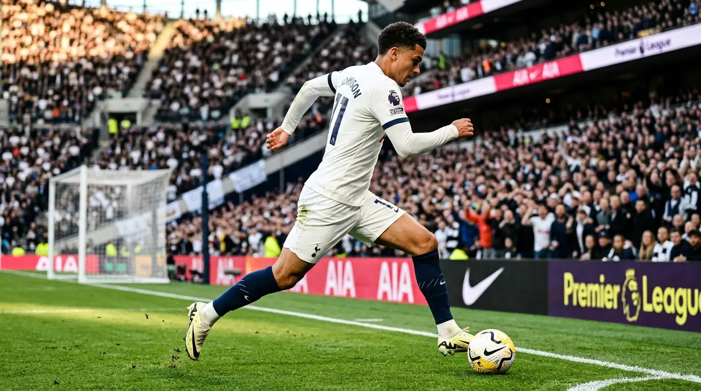
THE NEW HOME KIT:

FIRST APPEARANCE: Against Barcelona on July 24 in the Wembley Cup.
MY OPINION: I really like the detail around the neck and the puma badges on the shoulders look very smart. Fortunately, the script next to the Mansion logo, which features on all of the other kits, is absent here, though the red Mansion logo still looks out of place. The big change from last year are those yellow flashes. At first I disliked them greatly- too reminiscent of Leeds. United in my opinion- but they have grown on me, and make the kit stand out a little bit. Overall a solid effort- 7.5/10
POPULAR OPINION: The general consensus over at footballshirtculture is that the yellow flashes ruin the kit. “Superguy1” wrote: “Whats with the yellow on the home kit…looks ugly” whilst “marino st1” agreed, posting simply; “yellow destroys these kits…”. The yellow stripe wasn’t receivedmuch better at football-shirts/fans, with “Alex” writing how “the yellow on the home shirt completely ruins it”. The popular Spurs blog: http://www.dearmrlevy.com/ stated how “If it was not for the yellow bits, this would easily qualify as one of the smartest home shirts for a long time.” So overall, reception for the home shirt has been poor- 4/10.
THE NEW AWAY KIT:

FIRST APPEARANCE: Against Olympiakos on August 9th
MY OPINION: I’ve never really been a fan of the dark blue puma kits- I prefer the light blue away strips. Nevertheless this isn’t a bad effort and the yellow goes well with the blue. Not really a spectacular shirt, very similar to the away kit we had a couple of years back. 6/10.
POPULAR OPINION: Football-shirts/fans readers have shown quite a positive reaction, with “Smithy” writing “Nice, especially the blue one” and “Alex” writing “the navy kit is the best of the three”. Footballshirtculture readers have had a similarly positivereaction, with “Michael writing: “the navy kit looks class”. It’s around an 8.5/10 from the fans.
THE NEW ALTERNATE KIT:

FIRST APPEARANCE: Against Celtic in the Wembley Cup on the 26th of July.
MY OPINION: Horrible, horrible, horrible. I’ve got nothing against yellow Tottenham kits, but this really is horrible. The black lines down the side are utterly pointless and the kit doesn’t seem to have the same professional finish as the others. It would have been better if it was just all yellow- I really dislike the black finish. Plus, it’s just a rip off of the keeper kit last year. Poor effort. 3.5/10.
POPULAR OPINION: http://www.dearmrlevy.com/ writes: “I have utterly no idea what the lines/track marks are meant to be on the side” whilst “CC” disagrees, urging Spurs to “Keep the third kit – the yellow one”. The folks over at football-shirts/fans seem to be divided on the strip- Stoke editor I*T*P*L (http://stoke.footballblog.co.uk/) wrote: “the third is too bright and uninspired in terms of design” whilst “Matt” wrote “the 3rd kit is the only one I like”. 5/10 for popular opinion.
THE GOALKEEPER KITS:
The goalie kits didn’t have the big launch the outfield kits enjoyed, but all will be available on general sale when the other three kits are.


All of the new goalie kits follow the same template; the lines near the neck that feature on the home and away kit remain, and the background of the goalie kits feature a neat pattern. You can’t really see that in the picture above, but head on over to the Spurs shop to get a closer look.
The home keeper kit- the green one- is a very nice kit, I think the blue streaks around the neck work really well on the green: 8/10.
The light grey away kit is also very smart in my opinion and I feel it is up there with the best of our goalie kits- 9/10.
The grey and black alternate goalie kit is my favourite however, the white and black work well together and the kit is probably my favourite ever ‘keeper kit. It’s just a shame it’s an alternate kit and not the first choice keeper strip- 9.5/10.
So overall a mixed bag. All of the goalie kits are brilliant, the home shirt is quite nice, the away shirt is OK and the alternate shirt is horrible. Still as any fans know, it doesn’t matter what the players are wearing, as long as they’re winning.

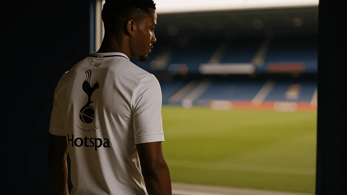
 Savinho to Spurs: City Must Now Decide on £60m Sale
- Meslier Joins Arsenal on a Free as Kepa Prepares to Exit
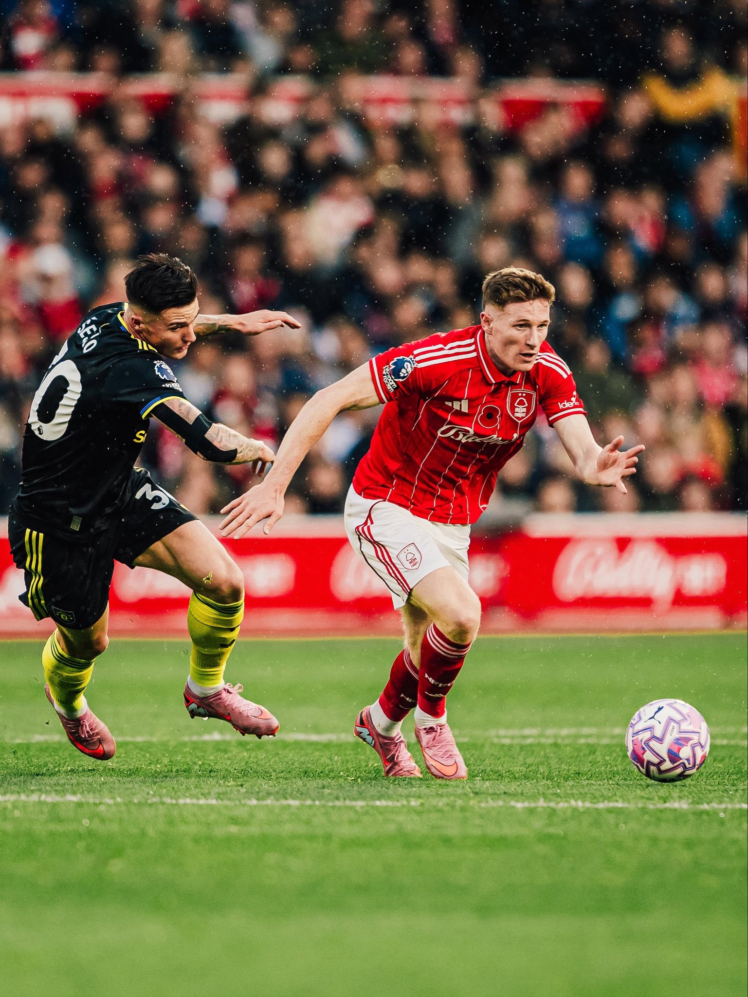
- Forest Demand Guaranteed British Record as City’s £120m Anderson Bid Looms
- Rashford Wants Barca or Bayern — Spurs Are Just the Fallback Option
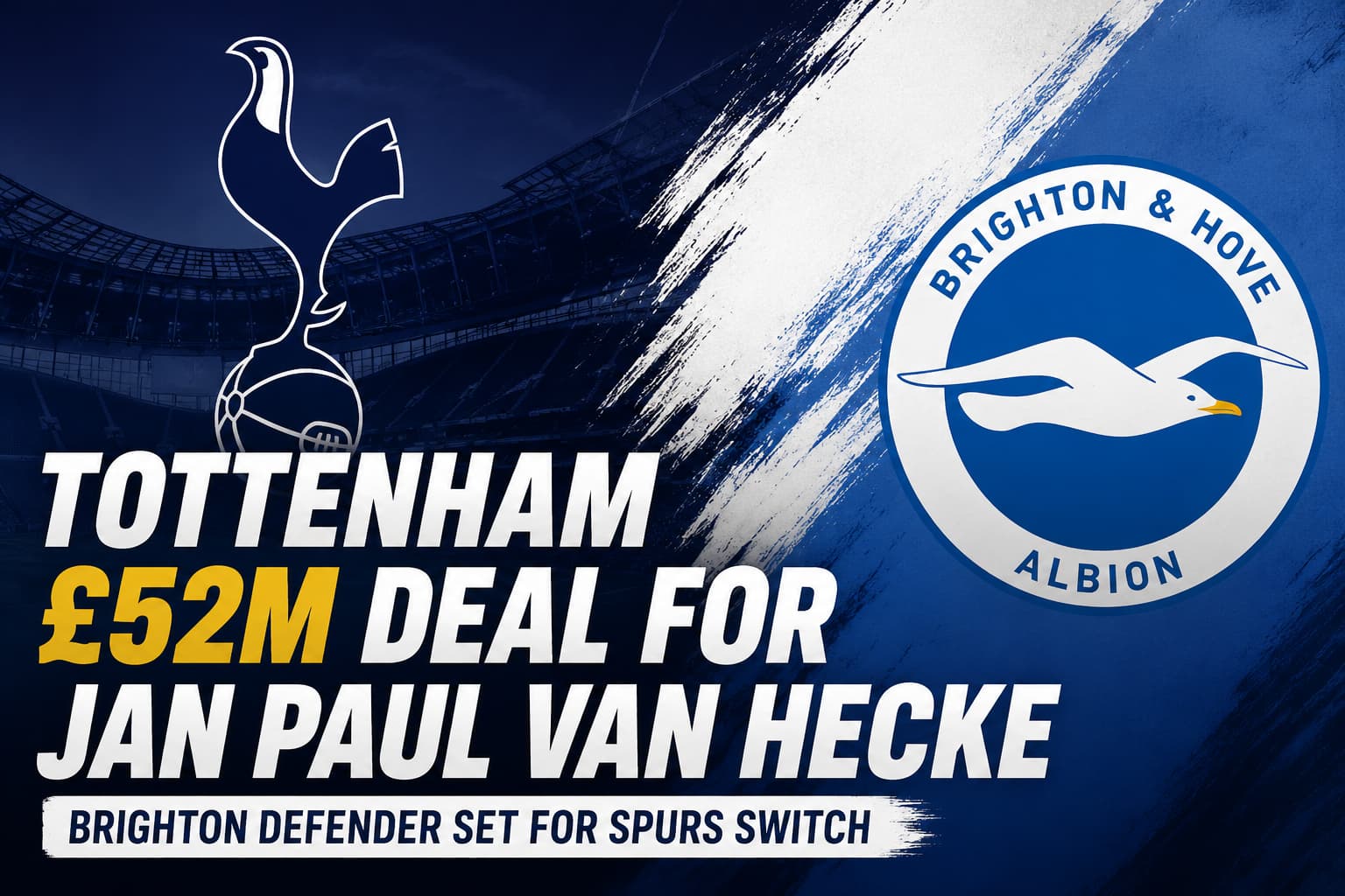
- Tottenham Agree £52m Fixed Fee for Brighton’s Van Hecke
- Tottenham Threaten to Hijack Summerville as United’s Window Unravels
- Liverpool and United Circle Juventus’s Thuram at €50m
- Arsenal agree personal terms with Manu Koné in €45m Roma deal
- Man United Target Summerville and Fernandes in £130m West Ham Double Deal
- Nico Paz Set to Stay at Como as Real Madrid Step Back


3 Comments
You must be logged in to post a comment Login